Superhuman: an email review
, 3,482 words

I was invited to use Superhuman in mid-March, and being a heavy Google Inbox user in need of a replacement, I signed up. Once you start using it, the app, your account manager, and the CEO (through automated emails) all send you repeated requests for feedback and opinions.
Once I’d had time to give it a good go, I took a few hours to think through the feedback, then wrote it up and sent it over. The account manager thanked me and looped in the CEO, CTO and Head of Mobile. I didn’t hear back from anyone, and the repeated requests for feedback and lack of engagement with feedback are incongruous, as are the underlying issues — all the more so when Superhuman is marketed as a product that makes the routine easier.
My own company has a cross-platform desktop app (not competing in any way!) and our products are used on macOS and iOS, so I’ve spent a lot of time over the years on native vs. non-native, etc.
I’ve been a hardcore Inbox user: bundling, pinning, reminders. I’ve tended to wrap it in Kiwi on macOS to make it easier to switch between accounts (work G Suite, home Gmail). I don't use keyboard shortcuts heavily in Gmail because I found them to be unreliable, Inbox is slow to respond, and sometimes gets in the way, meaning the wrong commands fire. So I tend to pound through my email doing GTD with one hand on the keyboard and the other hand mousing or track-padding. Outside of the mail, my Mac is pretty much keyboard driven. I regularly hit inbox zero.
I’ve lightly edited my feedback and posted it below in the form of a review, so that it might be helpful for others evaluating email choices.
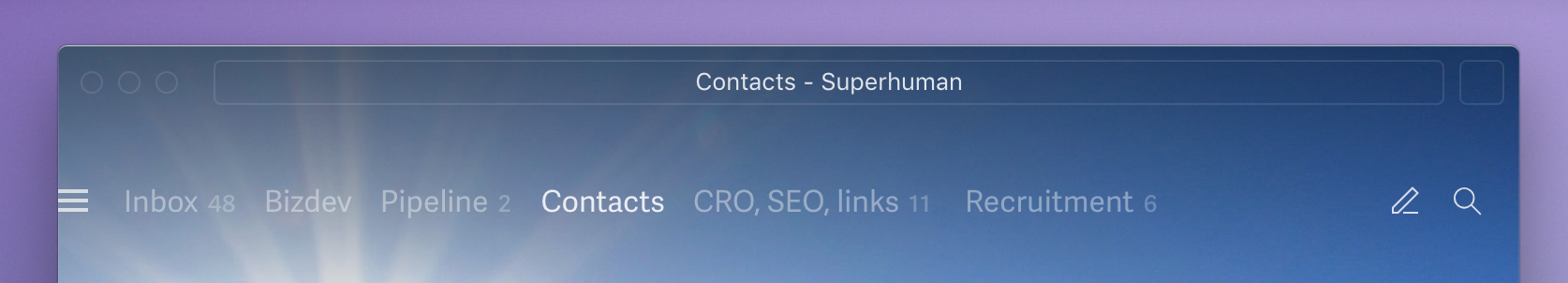
What is Superhuman?
Users of Superhuman are automatically signed up to a chain of automated emails that explain some of the goals behind the app. As Rahul the founder writes:
We’ve designed Superhuman to keep you in flow.
flow: the mental state of enjoyment, full involvement, and energized focus
In other apps, changing recipients breaks flow— you have to switch from writing to editing fields.
My view having used it, is that Superhuman is basically an email client with a Slack-style ⌘ Cmd + K command bar, and a set of extremely unusual custom interface choices. Email with a command bar is cool, but esoteric custom interface stuff is a massive impediment to getting on with the app. The interface is further burdened by being non-native, both on iOS and macOS. The macOS app uses Electron, which makes it far from fast or light-weight, and it’s not possible to right-click on anything in the app.
Why Superhuman?
Not just anyone can get access to Superhuman, and thus its appeal: it provides cachet to technology and entrepreneurial types where product access is increasingly egalitarian. If it's important that others know who you know, using Superhuman is a neat way to do that. Thus Twitter is not short of people eager to share an opinion on it, signalling they’re users.
Default signatures read “Sent by Superhuman” or “Sent by Superhuman iOS”, depending on the platform being used.
I had the opportunity to discuss it with a few other users at Business of Software, as I was curious to see if I was alone in thinking the interface was obtuse. The exclusivity of the system does a lot to encourage people to speak highly of the app, and Rahul the founder’s post on First Round Review alludes heavily to this. Users I spoke to couched it this way: “It’s going to be a long beta…” Yes. It is.
The service costs $30 a month: another way to signal to others just how valuable your time is! For that $30, you’re able to add multiple email accounts to the service: I used it for both my G Suite work email, and my home Gmail simultaneously.
Superhuman is currently in beta, and once you’ve been invited and signed up, access is via the TestFlight app on iOS, or through a hidden download for macOS.
How do you get it?
Either the Superhuman team approach you to sign up, or you get referred by an existing user. In my case, I’d been a power-user of Rapportive, which was Rahul’s former product. Onboarding is unusual, as it’s done in the style of a higher-paid B2B SaaS app: you pre-fill credit card details in a form, book a date for onboarding, and then join a 30-minute video call to get shown how to use it. As the call starts, your card gets billed and the onboarding process is essentially adding your own email account to Superhuman live on a screen-share. If you have any confidential email in your inbox, you may be wary of this.
Harmony in UX
-
I found the SH interface jarring. I sense the idea has been to strip it down, so the interface doesn’t create cognitive load. But all of the niggling differences compared to just about everything else are like a series of itches that as a user you just can’t scratch.
-
It’s in a non-standard font. Why not follow the system default — or, like Gmail, etc. — pick an uncontroversial sans serif? I have to squint to read SH, but I don’t have to squint to read any other email app. Why is the text so small and fiddly? And the font so narrow and tightly spaced? Why wouldn’t it respect font sizes from iOS or macOS? It’s so user-unfriendly. Do I only have this problem because I have a 5K screen?
-
The top nav of the macOS app is crushing me. It doesn’t look selected. It never looks like it has focus, either in Dark Mode or normal. It’s so eye-catchingly incoherent — I’m scared to type because the window very obviously doesn’t have focus. Yet it does. Agh!
In fact, it's completely identical — all white — whether it has focus or not. There's literally no way to tell whether Superhuman has focus or not.

-
Similarly, by virtue of not having a native bar, the top nav of the macOS app doesn’t make clear which bits I can select and drag to move the window. Why can I move it with the address bar? That’s weird.
-
Users get punished for getting to Inbox Zero: I have a nice, muted, distraction-free desktop. But if I get to Inbox Zero, I’m shown a really jarring image. Sometimes these Inbox Zero images are monochrome, with really bright whites and really dark blacks, but at other times they are in full — jarring, distracting — colour! It jars in dark mode, and it jars in light mode. Is there a way to have no image at all? The screen shouldn’t be made busier to indicate a lack of business — that’s no reward! This should be the other way around: show a high contrast, agitating image to encourage people to complete their email, and reward them with a muted screen.

-
I like to achieve Inbox Zero. But SH is cheating. I’m using split inboxes to replicate bundles. Emptying a split inbox is in no way Inbox Zero. It just means I’ve categorised stuff. Superhuman is encouraging users to hide email in other split inboxes — and not deal with it. 😕
Here you can see the "Inbox Zero" celebration image being shown, even though that's only because I've switched to a split view that has no email. My inbox has 48 unread, yet the UI is prompting me to tweet a message about using Superhuman to hit Inbox Zero.
-
There’s no “at a glance” view of what one needs to do in their inbox. That’s so important!
-
People who send and design emails aren’t expecting them to be forced into rounded boxes: it results in a lot of nasty clipping and visual glitches. Like how it mangles the Launch Ticker, below. (Interestingly, mangled Launch Ticker emails are shown in animated GIFs in the onboarding emails. It’s strange that these have gone out, given their rendering is clearly broken by Superhuman!)

Harmony of input
-
Swiping up and down is really annoying on modern iPhones, which already have gestures for swiping up and down which do completely different things. Sure, after a bit of practise I stopped accidentally swiping out of SH. I’ve not seen another app do this — I think I know why!
-
I get the idea behind making SH keyboard-first. I use a similar mechanism in Slack, Atom, Sublime Text, and so on. It’s a winner. But the keyboard shortcuts are punishing. It’s not so much that
Efor “archive” is weird, or#for “delete” is weird — it’s that they are on opposite sides of the keyboard. Must I always have two hands on the keyboard to read & process email? -
There are more painful examples of this: good keyboard shortcuts are single-handed (historically, with the exception of
Ctrl+Alt+Del— as it was a big deal). But if I want to discard a draft —⌘ Cmd+⇧ Shift+.— I have to break focus from the mouse or trackpad and use a command that’s impossible without two hands (or at least without using the right-hand⌘ Cmdand⇧ Shiftbuttons, which is pretty odd). -
Disharmony of input in Superhuman is more than simply keyboard shortcuts. Input elements are all over the place. To trash an email on mobile it’s a pull-down. Hand at the top of the screen. To archive, however, I must have my hand bottom right, scroll left, and then tap left. Gmail and other clients get this right, with all email functions top right — and shortcuts for reply and forward at the bottom. Why make the user’s hands jump all over the place? (Why must I even scroll those action buttons bottom left?)
-
It’s kinda neat that you can configure which buttons appear in the conversation view triage. But however you configure these, the same actions are in a different order for a selected email vs. an open email. As below, my actions are unread, delete, snooze, done on an open email. But if I select it in a list, they’re done, snooze, delete, unread, etc. Agh!
Here are the buttons in an email view (unread, delete, snooze, done):
But on a selected email, they're done, snooze, delete, unread, star and move:
-
There is one element in SH that stands out as being really well-positioned: the black “undo” widget that pops up on iOS. It’s great for thumb-tapping. But everything else feels a long way away.
-
On iOS I can create an email by replying with my fingers at the bottom of the screen — that’s where “reply” is. But if I want to create an email without replying, I must have my fingers at the top of the screen — for the “new email” button. Why not be consistent?
-
It’s neat that some settings sync between machines, but my swipe actions, conversation view triage and auto-advance don’t.
-
I understand the keyboard-first design, but the macOS app is really unfriendly for doing stuff with the mouse or trackpad. I can’t right-click and get a context menu. I can’t see how I can label an email with the mouse. Also, I can right-click to copy and email address but I can’t right-click to paste one? When I right-click in an email body I get a crappy Electron menu with a native system menu overlaid on it.
When the Wicked Witch in the Wizard of Oz screamed “I’m melting, I’m melting”, it was actually something like this that set her off:
-
Actually, it’s not just a lack of rapid right-click on macOS — there are some things made slow on iOS, too. If you want to perform an action on an email in a list view on iOS by selecting, you have to hold-press it. That’s crazy slow and awkward! Why not make the left-hand side of it selectable like Gmail does? This has already been solved.
-
There’s no pop-out browser on iOS. So rather than following links in a neat closable window, each time I click on a link from SH, I’ve got to go back into Safari at some point, and choose “tabs” before closing the many windows it led to me opening. It should be designed to avoid clutter through use.
Assumptions on presentation of data
It’s good to take a strong opinion or two when building a product in an existing space, and use that to build something your own way. I’ve been trying to understand some of the design opinions behind SH.
I think one assumption is metadata is more important that navigational elements. Thus they hide or minimise a lot of the UI — I can’t pin the left-hand nav permanently open, for instance.
I think this is wrong. Metadata that's shown (Rapportive-style) is a distraction. Yes, for leads it’s helpful. I’ve used a Copper plugin and Rapportive in the past. But one can minimise those things, and maybe 60%+ of my email is from colleagues, machines or brands. That meta-panel is either useless or irrelevant from them. (Superhuman’s early adopters are disproportionately investors, salespeople, right? Higher % of relevance here I suppose.) It’s more functional and less distracting to have the left-hand nav there — so I can browse emails with a mouse, for instance.
I note that SH has some of the same vulnerabilities that Rapportive had: if you get an email from Ahrefs, it comes up as being from “Best Amberg Auto Injury Attorney at Ahrefs” 🙄:

There are other ways that this data is unhelpful. A user’s last tweets are shown — without context. Even if they’ve not tweeted for years. Why show me tweets from 2 years ago? These should be hidden by default — and even when shown, the date should be clear.
There are some other challenges that come with minimising UX elements. Showing people’s faces is helpful. Why not include them in the main mail view? Or at least, make them optional? Similarly, why not colour-code splits?
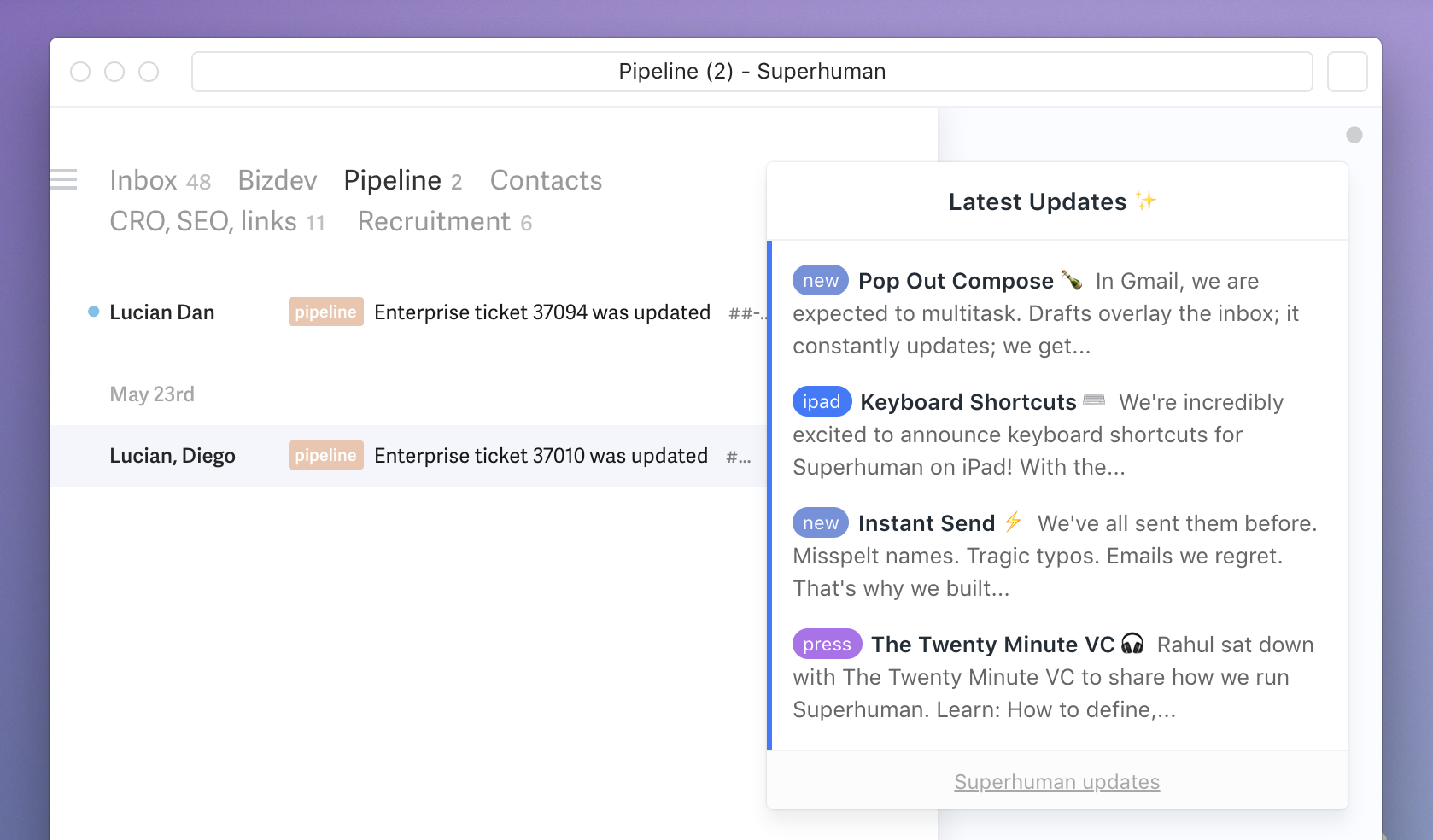
Also, if the design decision was to remove as much as possible and make the interface minimalist, why the clutter? The Superhuman logo, the red “what’s new indicator”, etc.? I’ve a desktop and laptop in the office, and a desktop and laptop at home. Every time an updated is posted, I have to read and dismiss it four times!
The Electron app used is pretty slow to load, and I don’t believe Superhuman have any plans to go native. I don’t massively love Kiwi, but I think what they do is interesting. They simply frame a Chrome window. By doing this it feels like an app — but it’s not nearly as slow as Electron, and it lacks a lot of the crappery (lack of right-click, etc., etc.) that Electron brings about. People sure do hate Electron.
I originally wrote this review as an email in Superhuman. It was a fairly long email, and I dragged a few images in. My desktops all have three screens — a 5K and two satellites. I’ve got a tonne of desktop real estate to be doing this, but no matter how big I make the SH window, I’m writing this email in a tiny box with a ~90 character line width, craning forward to write. (I had an eye test two months back; my vision is great.) Is it the font? The size? The narrow spacing? 🤷♂️
One area where a strong opinion is helpful: Superhuman exposes both “Move” and “Label” commands. Google Inbox is opinionated enough to combine these. In Superhuman, if you “move”, you’re moving email to a split and marking it as done, whereas if you “label”, you’re moving email to a split but leaving it as not done. “Move” and “Label” are not helpful names for those actions — they’re legacy.
Finally, on opinions. Gmail supports multiple document interface (MDI). You can have a bunch of drafts open at the same time. I find that really helpful. Superhuman is SDI — I guess because they’re arguing focus and flow is really important. Fair enough. But if so, why on earth does the top-nav on macOS let me run multiple different view-states of SH? By letting users spam multiple SDI interfaces… aren’t they just doing what users would otherwise be achieving with MDI?
Case in point: grouping email
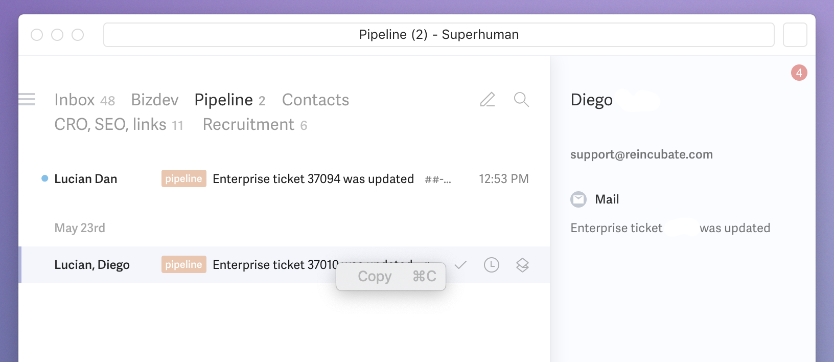
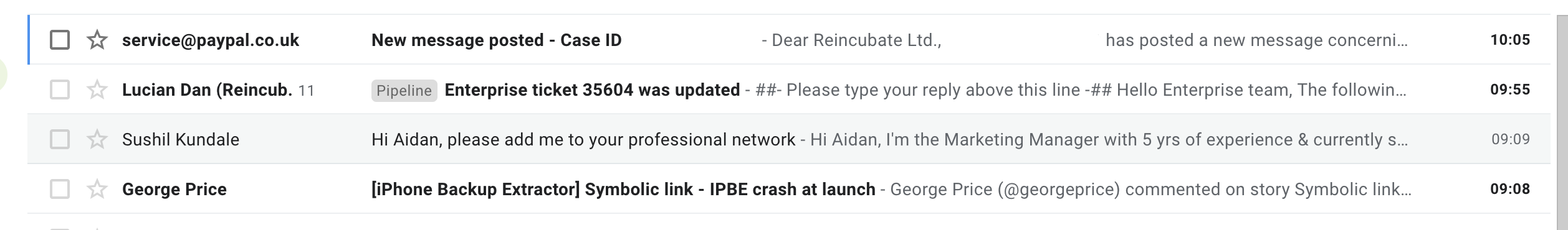
Email grouping doesn’t really work properly in Superhuman. Let’s take a look. Emails from LinkedIn — they who bought the founder’s last business — provide a good example of it:

That looks like a message thread with Charles, James, Sev, Vinnie, Sushil. Or it looks like a stack of 5 emails.
If Gmail had those five names and I clicked on it, I’d expect to see at least one email from each of them. If I click to open it in Superhuman, I only get the single email from Sushil. The other emails were deleted in prior days, before the email from Sushil arrived. The other emails show in the right-hand panel, but if you click on any of them you just get a white page, as below. They’re in the bin, unpurged, so it should be possible to show them. (Although you’d clearly have to indicate they were binned, if you did. And it’d be weird to show deleted emails in a thread that way.)
If I look at the email in Gmail, it displays properly:
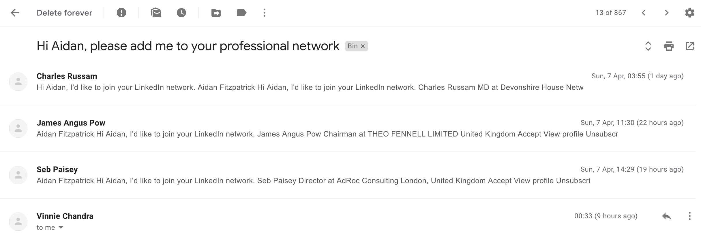
Here are the others in the bin:
I’m confused by how the grouping stays present. Is it that Superhuman is building a name list using emails in the bin? Or is it caching a list of sender names somewhere?
Protection of user privacy, data
If I view spam email, images are rendered. Ack! Rendering those images is what tells spammers that you’re reading and that they should keep sending. I get tonnes of crappy outreach from salespeople. Usually, the workflow is to put it all in spam, and manually check one or two, safe in the knowledge that whoever spammed me won’t see an image open recorded in their delivery tracking software. Gmail, Inbox, etc. respect this.
I wrote in and asked for a link to the privacy policy, as I couldn’t find one anywhere. It’s here, and it looks reasonable.
Branding
Superhuman's icon is a lot like the icon for Balance. Black? It’s like an icon for a nightclub or a status card: trying to to evoke status. Productivity apps are generally white with blue or green. If you reduce it to a monochrome silhouette, is it easily recognisable at a distance?
![]()
The all-caps Superhuman text is similar to Uber in trying to convey exclusivity. Uber’s culture — and why they do that — is pretty well documented. Other than FoundersCard, they’re the only other black logo people I can think of on my phone or Mac.
That said, it’s possibly not surprising that there are similarities between Uber and Superhuman’s branding: Superhuman literally is “Ubermensch” in German.
Rounding up
Superhuman repeatedly hit me with a massive cognitive load — enough that I kept finding myself going back to Gmail because it just felt easier and clearer. Easier to read the screen, more intuitive to click around and sort stuff out whilst juggling talking with colleagues, etc.
I think Superhuman is picking two fights that are unrelated. The first is: can Superhuman do email better by adding a Slack-like command bar into a client, making keyboard-first work, investing in top quality cross-platform clients, and building an excellent on-boarding process? I’d totally bet on that.
The second is: can Superhuman reinvent HCI with an idiosyncratic UI that disregards a lot of smart work in UX design patterns, layouts, fonts and flows that’s been well-tested, proven and that have low cognitive load? I don’t know, but picking this second fight sure gets in the way of winning the first one.